Progress
Activities during my project
Assessment - Figma
UX & UI Research
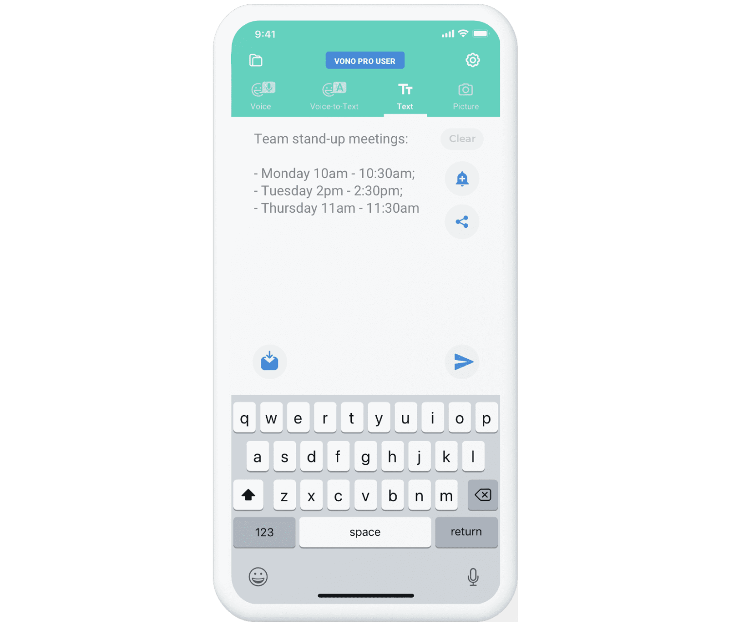
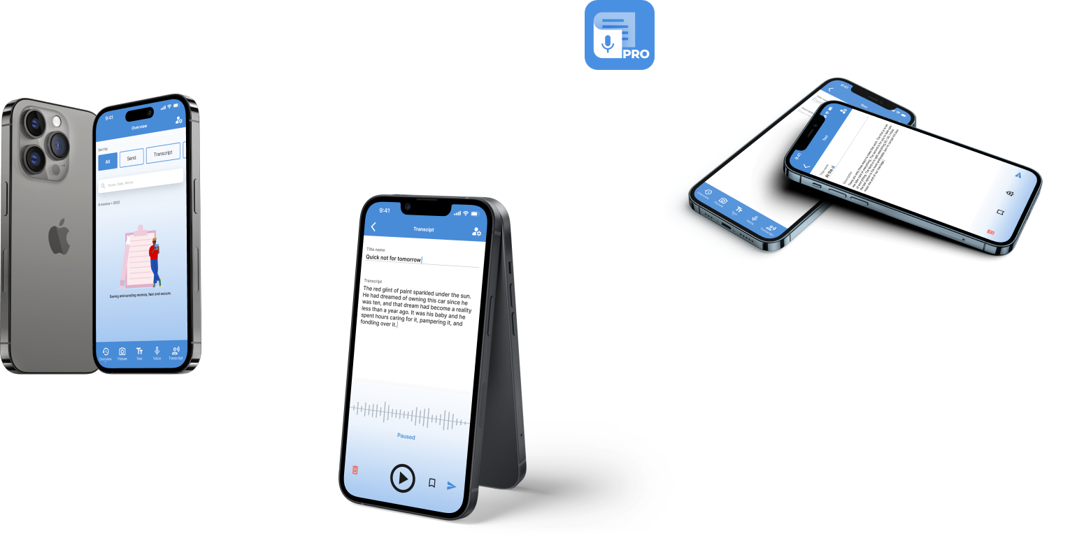
VoNo is most often used by busy people in the 20-45 age group, who like to keep their ideas organised and want to quickly take notes while performing other tasks. The core ‘memo’ functionalities include: ‘Voice-to-Text’, ‘Voice’, ‘Text’, and ‘Photo’ memos.


Assessment - Figma
The Objective
The client would like to improve the UI/UX of the app and completely change the visual style. They want to provide the client with an updated version of the home screen (which includes the four ‘memo’ functionalities) and improved memo sending flow. The home screen should be intuitive and reflect the needs of the user. The process of sending memos should be fast and allow the user to easily select the desired email address(es).
Research & Visualisation - Figma
Design System
At the beginning of the process I looked at the problem and the wishes of the customer. From there I looked at the current flow of the app. I also looked for more information from their website. By making an empathy map I mapped out the problem and I was able to look up and sketch some ideas. During my internship at Total Design I learned to work in a design system and I worked from the atomic design. For more info check out my design system, you can find the tabs at the top left.
View Design System
Interaction & Visualisation - Figma
The Prototype
Based on my insights and paying attention to different design principles, I was able to create an interactive prototype. In addition, I created a workflow before delivery in which I explained my screens.
View Workflow View Prototype